BTSYA
A BRAND AND RESPONSIVE WEBSITE REDESIGN FOR Be The Star You Are (btsya), A NONPROFIT ORGANIZATION committed to enhancing children’s literacy, a critical foundation for lifelong learning and success.
◼ Role
DESIGN LEAD
◼ PLATFORMS
RESPONSIVE WEB
◼ areas
WIREFRAMING, BRAND DESIGN, SYSTEMS, VISUAL DESIGN, PROTOTYPING, UXR, STRATEGY
◼ COLLABORATORS
ABBY, ALLISON, SU
btsya’s mission is to help make a difference in the literacy of our nation, yet their website is hard to navigate, understand, and discover.
44 million Adults in the U.S. are illiterate, and that number grows by 2.5 million each year.
70% of Low-income fourth-grade students struggle with basic reading.
The primary cause of illiteracy is access to books And this doesn't just affect historically underserved communities.
Middle and high school students nationwide are encountering fewer books in classrooms due to budget cuts with many families not having books at home to fill the widening gap.
problem

We audited btsya’s existing site and found issues with consistency, accessibility, lack of branding, dense and miscategorized content, and major usability issues.
How might we communicate BTSYA’S mission effectively so that their website inspires people to get involved?
research
Journey map
[replace this] we interviewed and surveyed 21 participants to understand their use-cases and struggles.
our findings
70% of people purchase their meals from fast food delivery services ON A WEEKLY BASIS.
80% care most about the affordability of their meals and 60% want to be able to save time.
40% of small business owners rely on online sales to reach their audience.
over 65% of small businesses struggle with customer acquistion and trust.
Affinity Mapping
We extracted themes based on the needs of each user type and identified core features that we needed to consider for the experience.

creative matrix
We then performed a “How might we” exercise to define how we could reduce barriers to entry for selling food & competing with established restaurants while supporting small-scale local sellers.

DEFINING THE CONSUMER EXPERIENCE
We decided to focus on defining and designing the consumer experience for this case study. Our process consisted of leveraging journey mapping, creating flow charts, and the MOSCOW method, an acronym derived from the first letter of four prioritization categories: M - Must have, S - Should have, C - Could have, W - Won’t have. my role specifically was to create the visual assets facilitate my group to align on our findings.

FLOW CHART
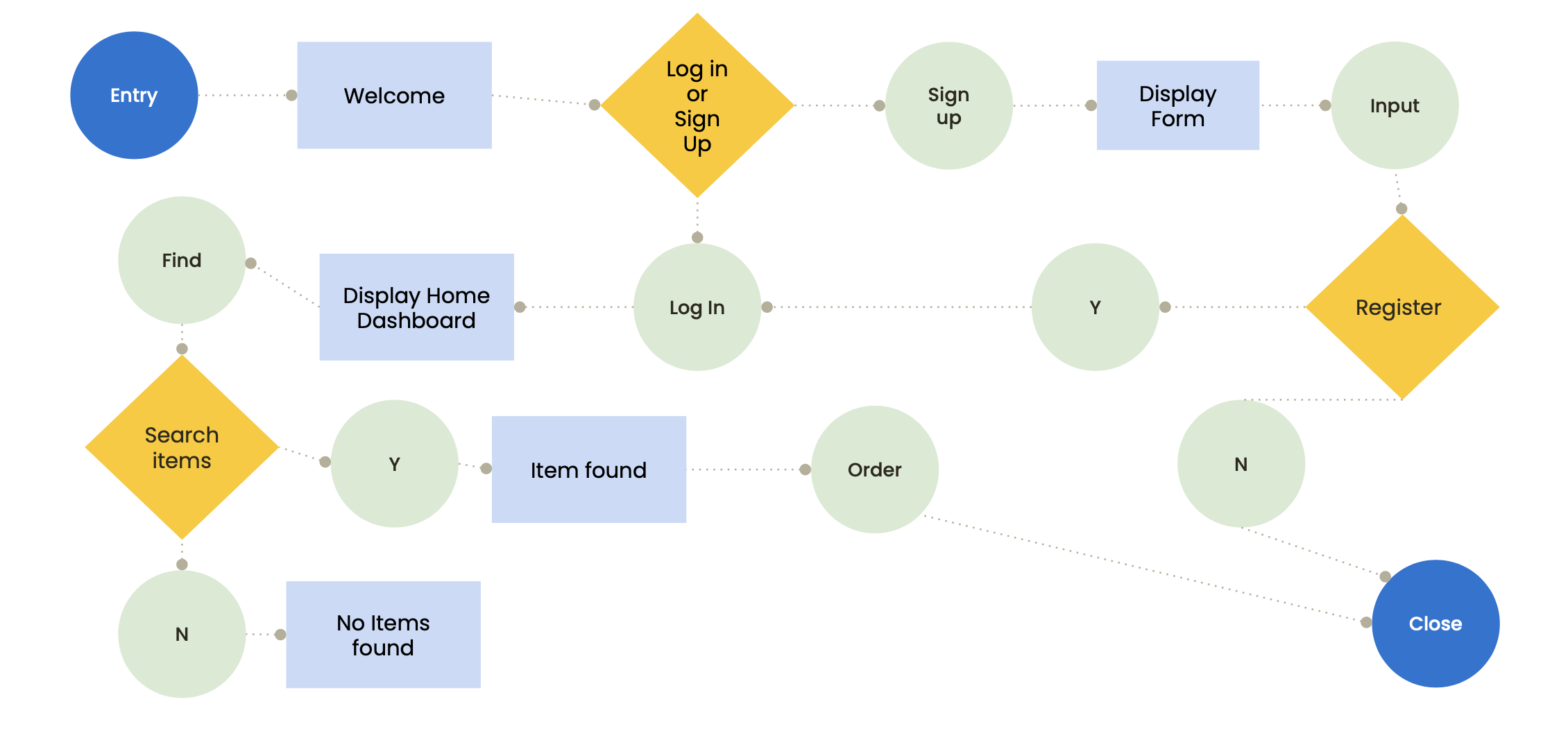
prioritization matrix

IDEATION
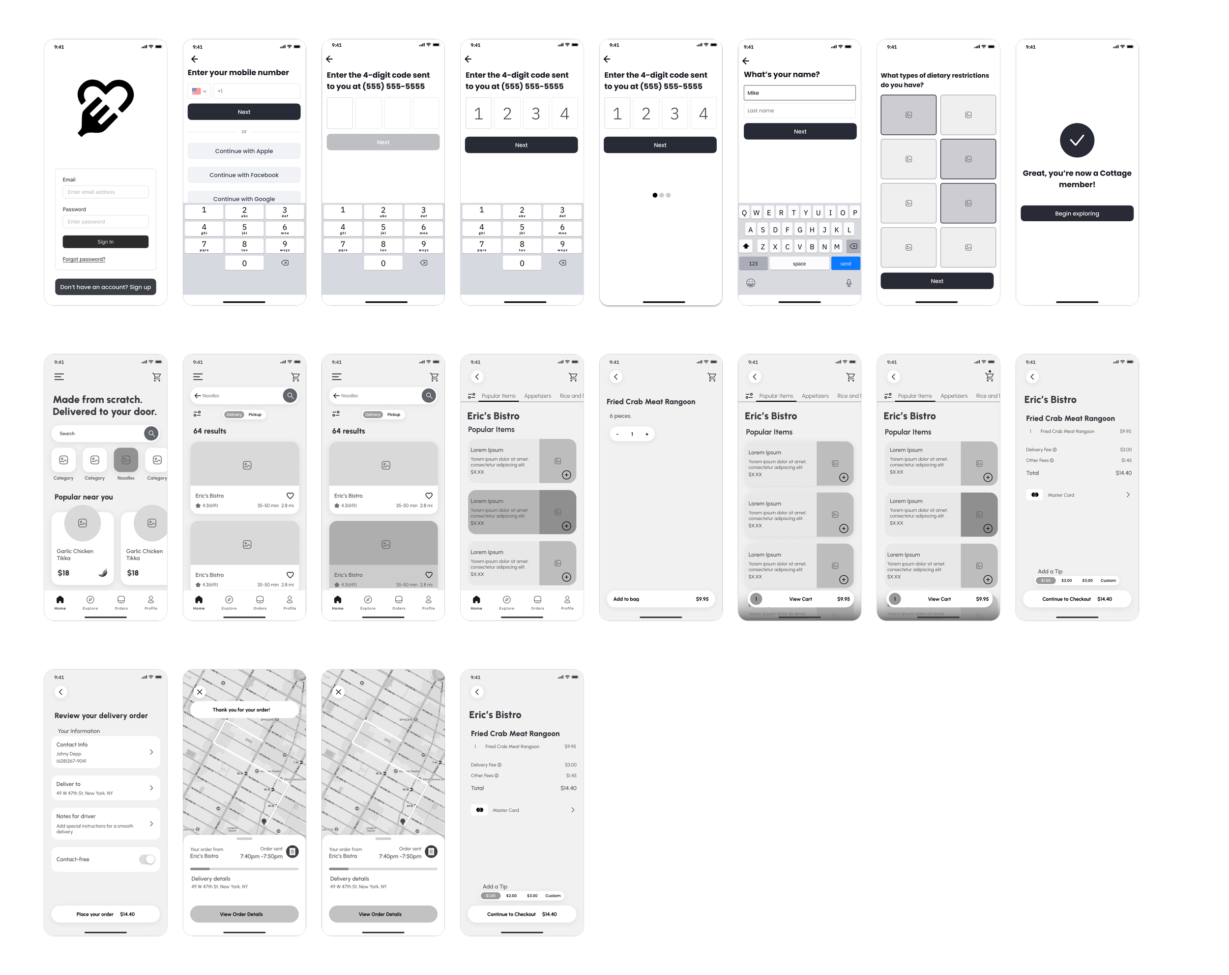
I then created low fidelity wireframes for our core flows including: app onboarding, sign up/log in, primary navigation, catalog browsing, product landing pages, and a component system for my group members to integrate details like the checkout flow.
solution
solution
Through usability testing we found that consumers want: customizable orders, order flexibility, payment notifications/alerts, and the option to keep shopping. WE UPDATED OUR PROTOTYPES AND DESIGNS TO ACCOMMODATE CORE NEEDS. I WAS RESPONSIBLE FOR THE VISUAL LANGUAGE, HIGH FIDELITY PROTOTYPE, AND ITERATIONS TO THE CORE FLOWS I HAD WIREFRAMED.
