CoTTAGE
a food delivery app ThAT BRINGS SMALL-SCALE FOOD BUSINESSES AND CONSUMERS TOGETHER—CREATING A shared experience of CONNECTION and discovery for the local food scene.
◼ Role
DESIGN LEAD
◼ PLATFORMS
mobile / ios
◼ areas
WIREFRAMING, VISUAL DESIGN, PROTOTYPING, UXR, STRATEGY
◼ COLLABORATORS
Katherine Buchanan, Ananya Pyata, Felice DeNigris
Many people struggle to balance busy schedules with cooking home-cooked meals.
Americans spend more on fast food than on education, personal care, and entertainment. the average American spends 33 minutes per day preparing food, WHICH suggests that many rely on fast food alternatives due to busy lifestyles and limited time for cooking.
Local food producers need a way to easily find new customers and efficiently manage orders because utilizing manual tracking and word-of-mouth marketing restricts their reach and adds complications to their operation of business.
Recognizing this challenge, paired with the desire for SMALL-SCALE businesses to more easily find customers, we saw a massive opportunity to help people regain control OF THEIR DAILY LIVES, HEALTH, AND ABILITY TO EARN REVENUE.
problem
research
Journey map
we interviewed and surveyed 21 participants to understand their use-cases and struggles.
our findings
70% of people purchase their meals from fast food delivery services ON A WEEKLY BASIS.
80% care most about the affordability of their meals and 60% want to be able to save time.
40% of small business owners rely on online sales to reach their audience.
over 65% of small businesses struggle with customer acquistion and trust.
Affinity Mapping
We extracted themes based on the needs of each user type and identified core features that we needed to consider for the experience.

creative matrix
We then performed a “How might we” exercise to define how we could reduce barriers to entry for selling food & competing with established restaurants while supporting small-scale local sellers.

DEFINING THE CONSUMER EXPERIENCE
We decided to focus on defining and designing the consumer experience for this case study. Our process consisted of leveraging journey mapping, creating flow charts, and the MOSCOW method, an acronym derived from the first letter of four prioritization categories: M - Must have, S - Should have, C - Could have, W - Won’t have. my role specifically was to create the visual assets facilitate my group to align on our findings.

FLOW CHART
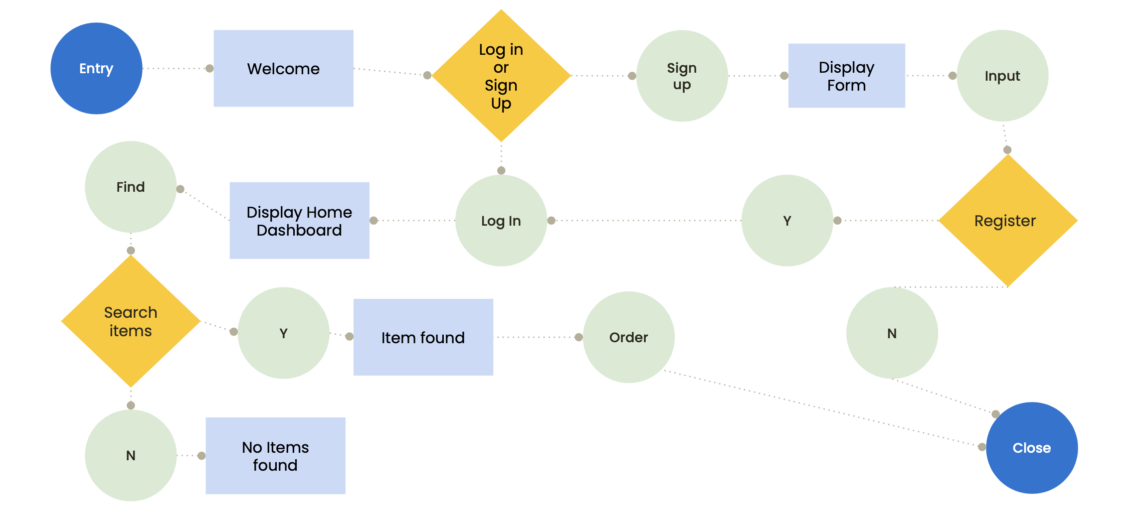
prioritization matrix

IDEATION
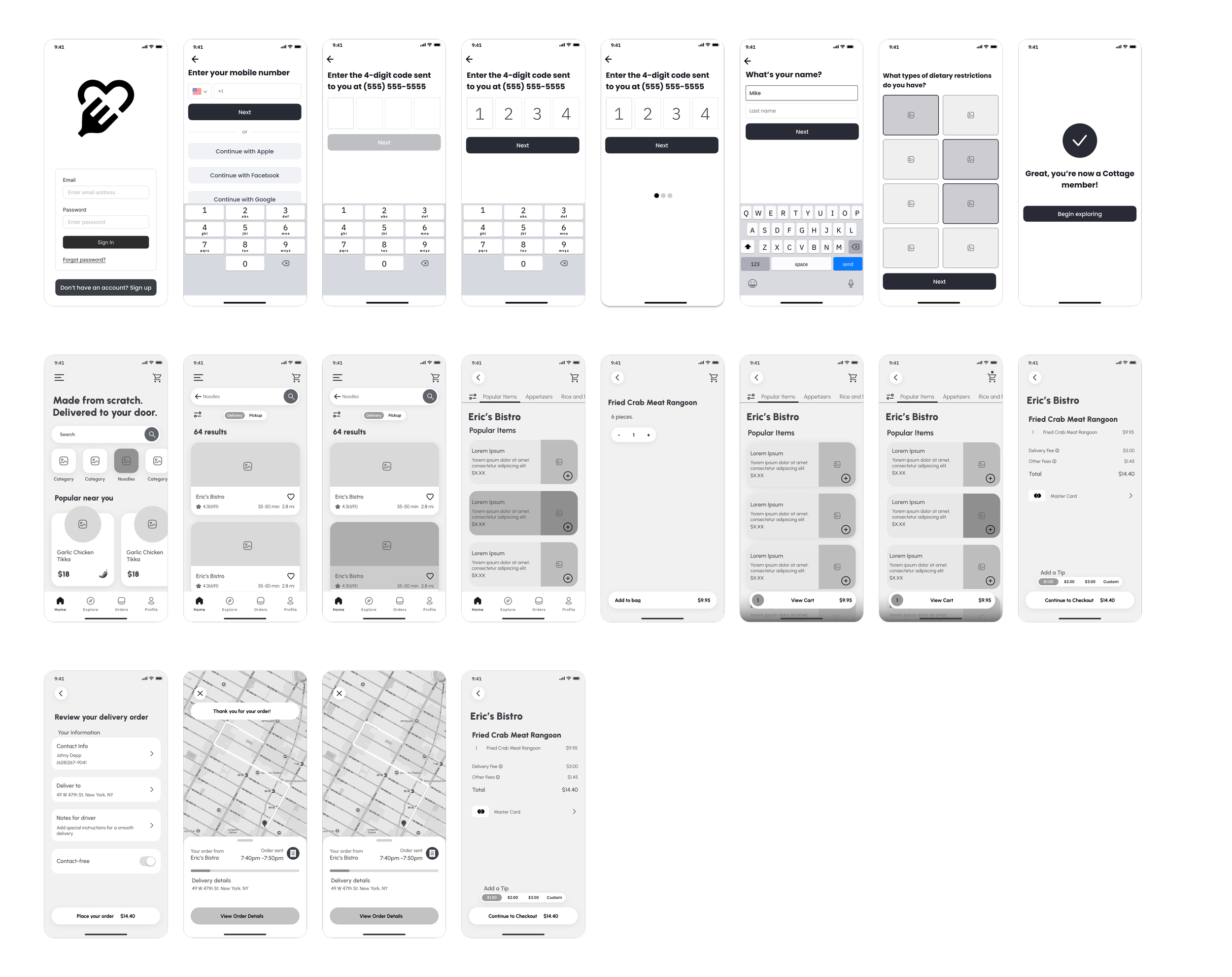
I then created low fidelity wireframes for our core flows including: app onboarding, sign up/log in, primary navigation, catalog browsing, product landing pages, and a component system for my group members to integrate details like the checkout flow.
solution
solution
Through usability testing we found that consumers want: customizable orders, order flexibility, payment notifications/alerts, and the option to keep shopping. WE UPDATED OUR PROTOTYPES AND DESIGNS TO ACCOMMODATE CORE NEEDS. I WAS RESPONSIBLE FOR THE VISUAL LANGUAGE, HIGH FIDELITY PROTOTYPE, AND ITERATIONS TO THE CORE FLOWS I HAD WIREFRAMED.
